Cutlery design for Heston Blumenthal Restaurant "The Fat Duck"
Thursday, 21 March 2013
Wednesday, 20 March 2013
Final designs ideas
These are my final design ideas for the cutlery for Heston Blumenthal's restaurant.
This fork has been designed to co inside with Heston's theme of stimulating the senses.
Here I was inspired to create a fork that had the handle style of the knife. This is visually stimulating and adds a new weird and wonderful way to enjoy dining at Heston's.
This spoon design shows the surface rendered with rough gold and smooth good. My reason for these colours and textures was to make it a visually beautiful object.
My final knife design comes from the simple curves that flow from the body of a "fat duck".
I positiioned the blades at both sides to add a strange experience. The handle can be wraou arounf around the back of the hand or can be held by the hand. This design will encourage users to use cutlery in a new way.
3DMAX TUTORIALS
My experiments with 3DMax tutorials.
Below is some of my finished tutorials using 3D max software. I found this difficult to grasp and I was unable to follow the tutorial to this extent during lecture. With persistence to learn I am now content that I have challenged myself to overcome my fears and begin to enjoy the experience of 3Dmax.
Below is some of my finished tutorials using 3D max software. I found this difficult to grasp and I was unable to follow the tutorial to this extent during lecture. With persistence to learn I am now content that I have challenged myself to overcome my fears and begin to enjoy the experience of 3Dmax.
Monday, 18 March 2013
Rendered prototype
Rendered Prototype
Experimentation using photoshop to further the design idea.
I see this knife to made of brass, very smooth and with a little bit of weight but not too heavy as it would be hollow.
Experimentation using photoshop to further the design idea.
I see this knife to made of brass, very smooth and with a little bit of weight but not too heavy as it would be hollow.
More sketch work
More Sketch work
As I want to explore the visual aspect of the cutlery I have began by looking at the shape of the cutlery. Here I have taking the shape from a duck ( taking form the name The Fat Duck Restaurant) and extracted the curve lines. This will be my basic shape for all my cutlery therefore linking them to the restaurant. Also considering the style of restaurant I want to make these look unusual and visually attractive.
Below is sketches of ideas that I have developed.
The curve lines of the duck created the shape.
The feather shape blades also linked to the duck.
Isometric exploding.
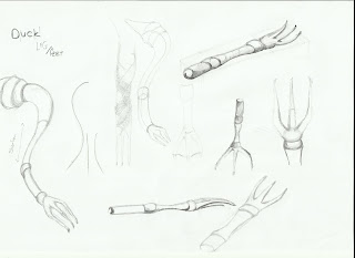
The fork keeps the shape and the handle.
Ducks feet.
The first basic sketches for a fork.
The fork head.
Wednesday, 13 March 2013
ISOMETRIC DRAWING AND DESIGNERS
EXPLODED ISOMETERIC PROJECTION
I have began to look into how I should design my cutlery. I found a site http://www.technologystudent.com which has nice examples to work from. It also explains interesting design processes.
The exploded isometeric projection is definately a way I want to design my cutlery as it will help me to understand how it connects and looks when broke apart. This is a way to show a design in 3 diminsions, a 30 degree angle is applied to the sides.
Tuesday, 12 March 2013
Hand Ergonomics
Subscribe to:
Comments (Atom)


